[Seoul Bike] 03. Trip Pattern in Mapo County
In our last episode, we explored the trips taken in February of 2021. In this post, let’s carry out a deeper analysis of Mapo county in specific.
1. Trip Analysis by Time
1.1. # of Rents by Hour
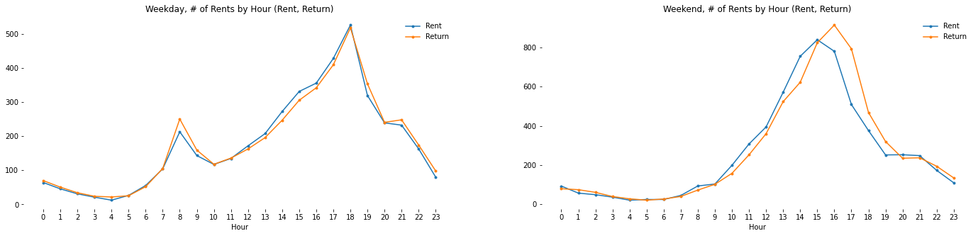
- During weekdays,
- Rents/Returns hit the peak at 8am and 6pm which is similar to the pattern of Seoul as a whole.
- Given that there are more returns at 8am and more rents between 16pm and 18pm, we can infer that many users are commuting to Mapo county from other counties.
- During weekends,
- # of Rents keeps rising early afternoon (until 3pm)
- # of Returns shows a similar pattern with 1 hour lag and hits the peak at 4pm
- The pattern may be different throughout the year depending on the temperature and sunset time.
1.2 Distance & Trip Duration by Hour
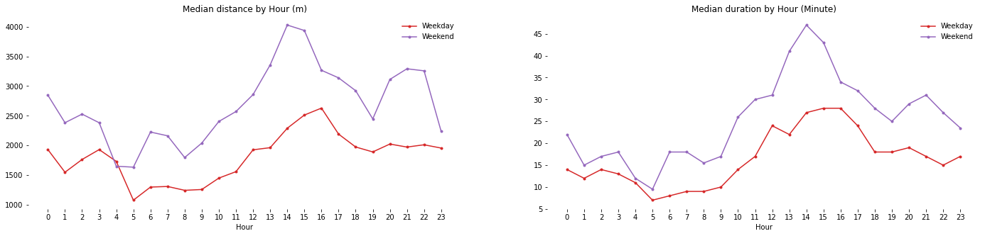
- The distance and trip duration have similar pattern in both weekdays and weekends
- The overall # of is higher during weekends.
- # of Rents/Returns is highest between 12pm and 4pm. This might be because that’s the warmest time of the day in February.
2. User Analysis
2.1. Usage Comparison by Sex
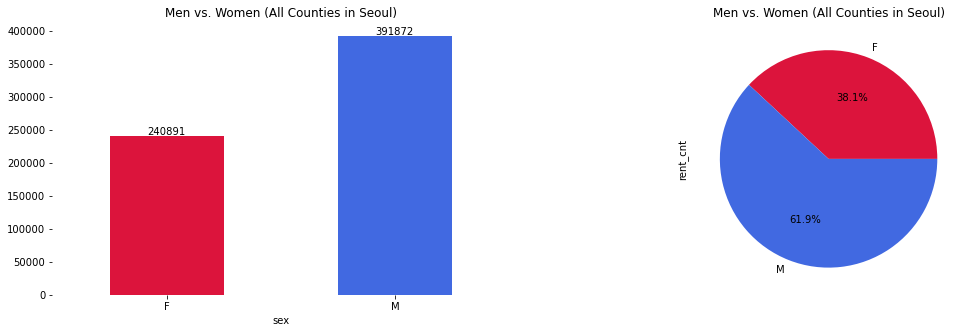
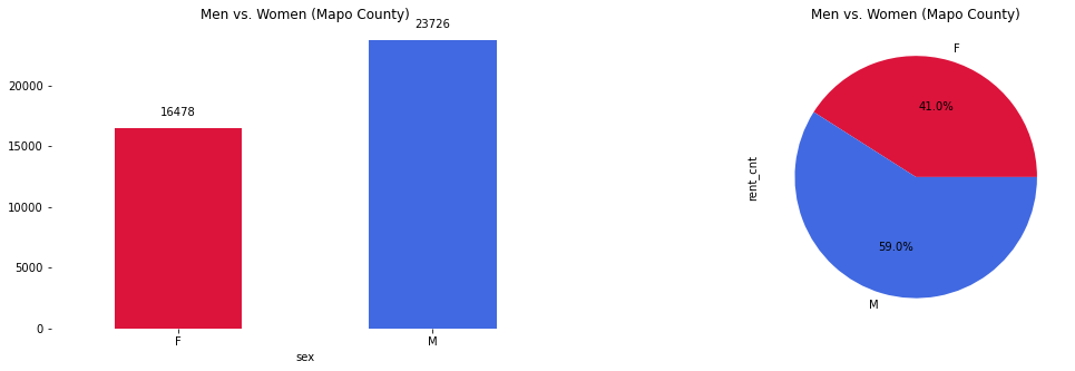
- Men’s usage is greater than women’s usage in both Mapo and all counties in Seoul
- The ratio of Men to Women is 59:41 for Mapo compared to 62:38 for all counties in Seoul. Ratio of women’s usage is slightly greater (3%)
2.2. Usage Comparison by Age
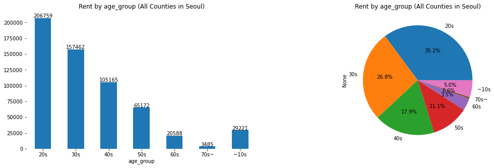
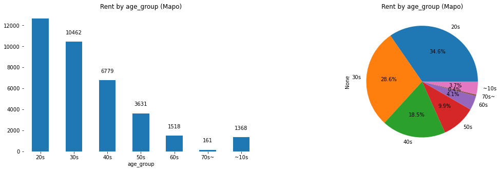
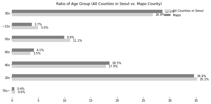
- Compared to all counties in Seoul, Mapo has similar usuage rates across all age groups.
3. User Groups by Station
In this part, let’s try to find stations that answer the following questions:
- Are there stations with a big difference in usage ratio between men and women?
- Are there stations that a certain age group is more frequently using?
3.1. Men-Women Ratio by Station
If we could find some patterns of a specific group, such information can be utilized for many promotionl events. For example, if one is running for a mayoral or governor position and wants to attract voters from a specific group, he/she can go to the stations where that specific group of users are using bikes most frequently.
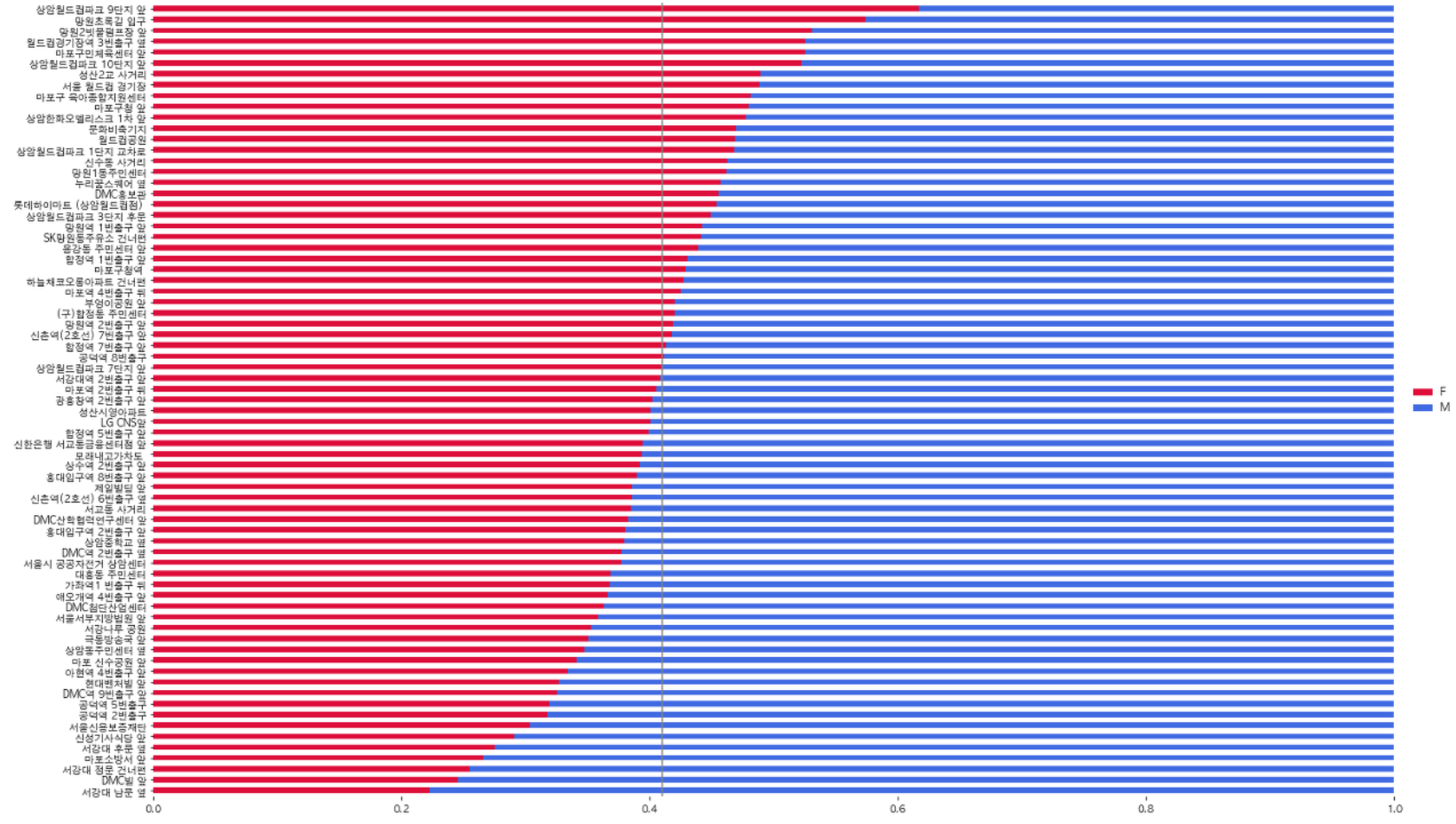
In “2.1. Usage Comparison by Age” section, we observed that the men to women ratio was 59:41. The grey line in the middle is at 0.41, which is the standard that determines whether a station has more women or men.
Stations with red bars greater than the grey line represent stations with higher women usage ratio and vice versa.
3.2. Ratio of Age Group by Station
Next, let’s see if there are stations with statistically significant differences by age group.
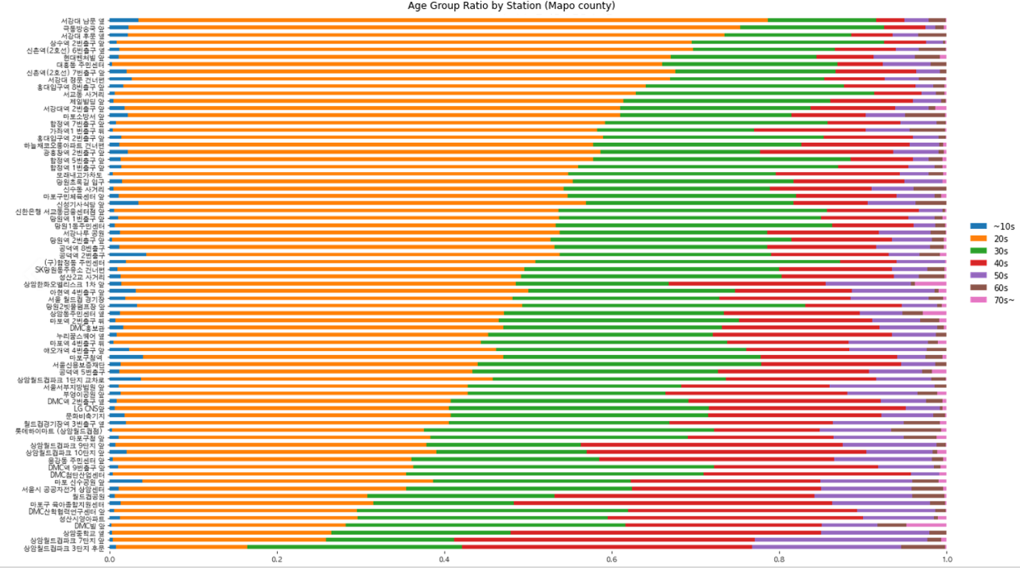
Stations are sorted in the descending order of age group 20s. There seem to be differences in usage by age group.
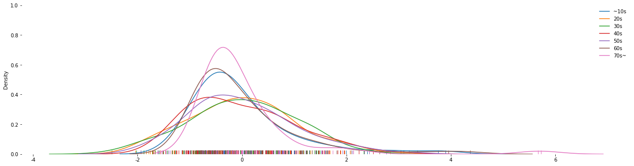
The distribution plot above demonstrates the normalized distribution of all stations by age group.
- Age group 20s and 30s are most normally distributed. In other words, there exists deviations in these groups.
- Age group 10s and 60s have similar distribution.
- Age group 70s~ have the least deviation in ratio.
- Age group 70s~ have one value that exteremly high which indicate that there is a station that’s more frequently used by age group 70s~ than others.
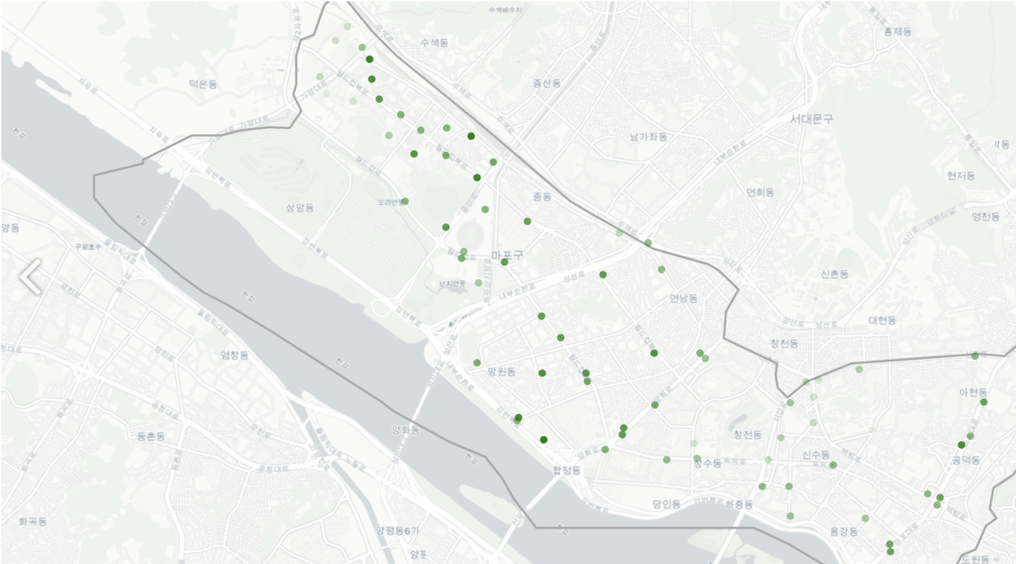
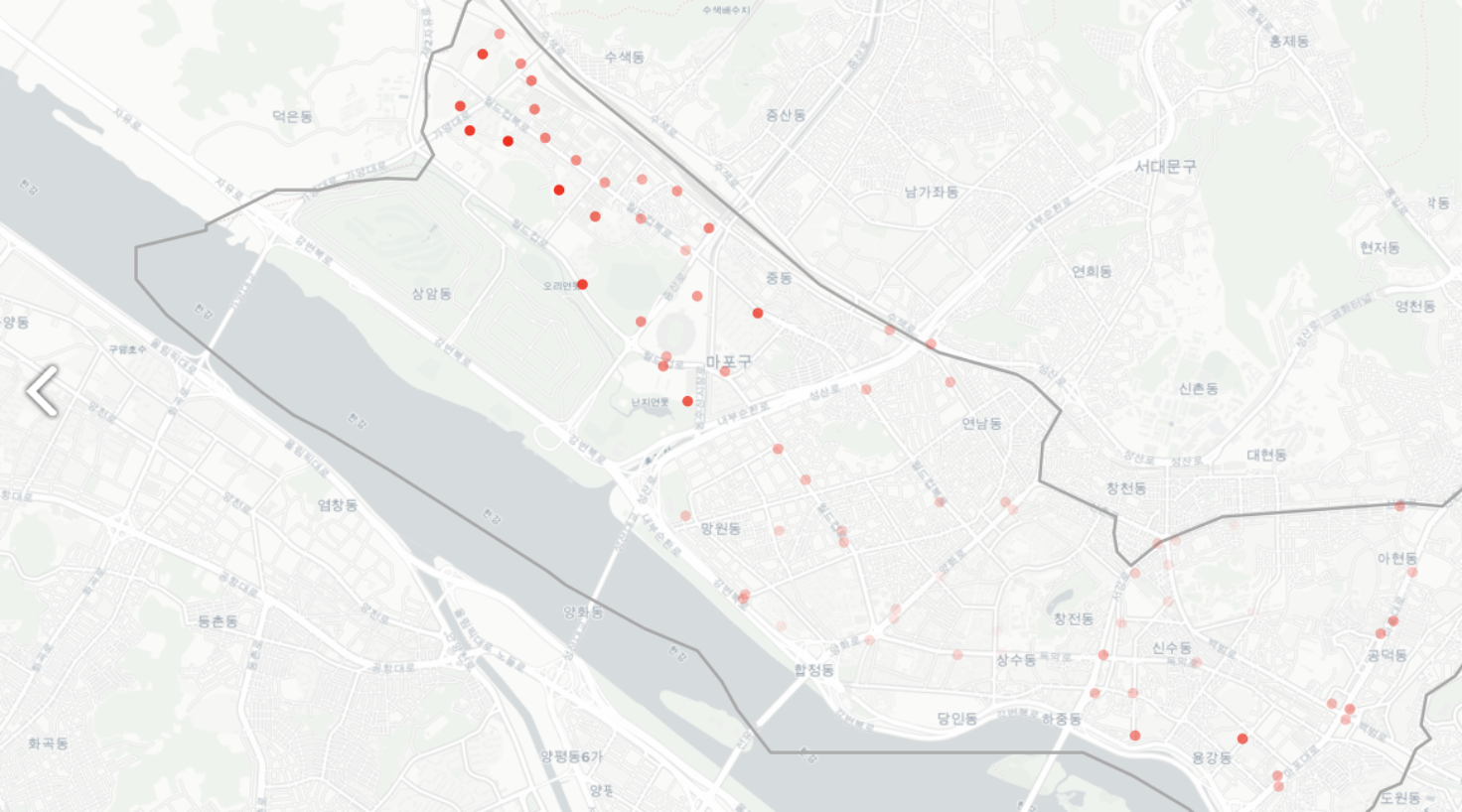
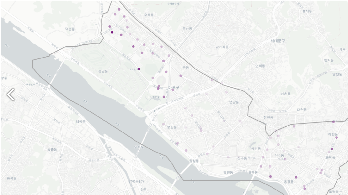
However, it’s quiet difficult to find which stations are frequently used by which age group. Let’s draw a map of stations used by each age group.
- Each point represents a station.
- The darker the color is, the more frequently the station is used.
~10s
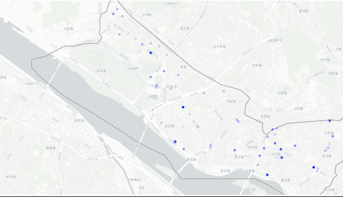
For users in 10s age group, these are the stations with high usage rate:
- 공덕역 2번 출구 (1.00)
- 마포구청역 (0.90)
- 마포 신수 공원 앞 (0.87)
- 상암 월드컵파크 1단지 교차로 (0.84)
It does not seem to have a distinctive pattern.
20s
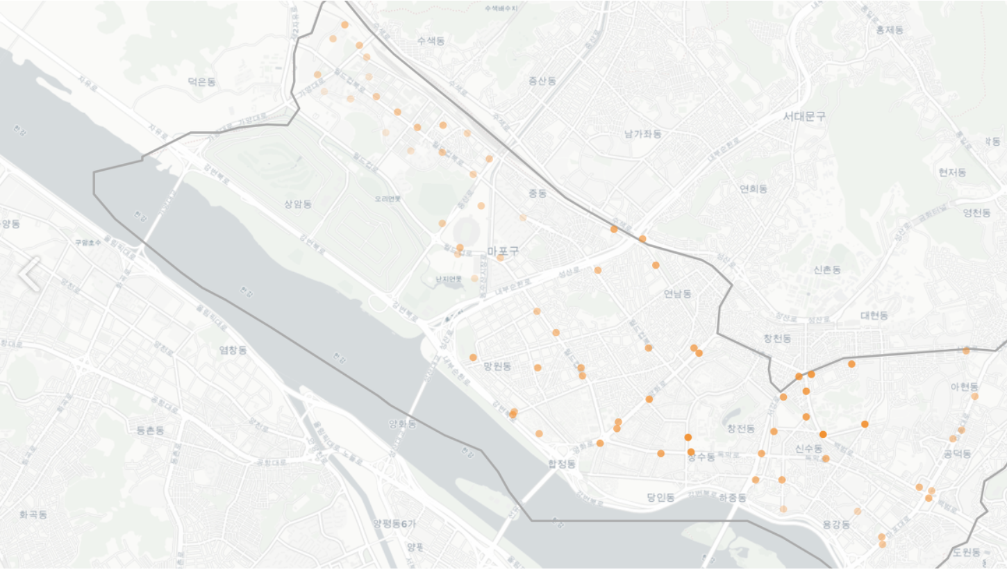
- For users in their 20s,they are using stations nearby college towns.
30s
- For users in their 30s, they are more widely spread compared to those in 20s. They seem to be using stations where most offices are located.
40s
- For users in their 40s, they are heavily using stations nearby DMC area (upper left corner) which is quiet different from other age groups.
50s
- For users in their 50s, they seem to have similar pattern with those in 40s.
60s
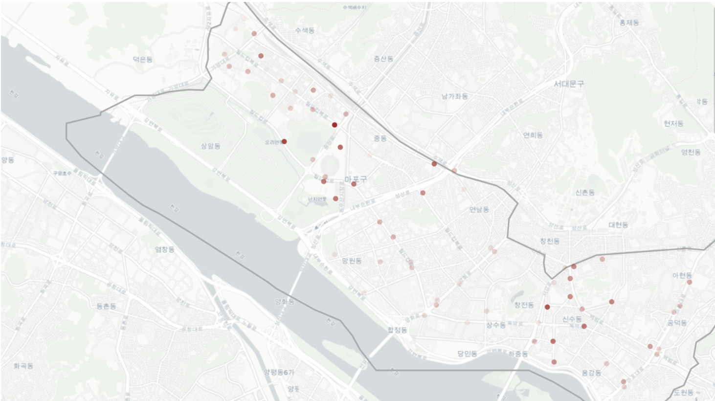
- For users in their 60s, they are using stations nearby Mapo County Office and Changcheon-dong, where 2 story houses are located (Just like city of New York, most people live in apartment in Seoul).
70s~
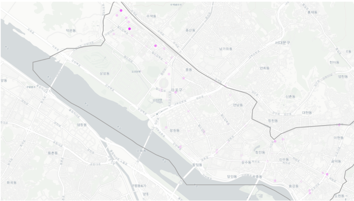
- For users in their 70s, they are using stations at a specific region in DMC.
4. Frequency of Trips between Two Stations
In this part, let’s take a closer look at the trip route.
It’d have been better if we have access to the exact path that each trip took place, but we only have origin and destination information in our dataset.
Given what we have, let’s draw lines from origin to destination with the following rules:
Each dot indicates a station. Each station’s usage ratio (Rent + Return) is represented by transparency. The greater usage ratio, the thicker the line is. Each trip from origin to destination is reperesented by a line. For routes with relatively high frequency, we indicate those routes with arrows (because it’s hard to interpret the map if we were to draw arrows for every trip). We will looking at weekday trips only. (Excluding trips on weekends) Assuming that trips have different patterns by different time of day, we will split the day into specific times and look for patterns.
4.1. Commute to work (7am ~ 10am)
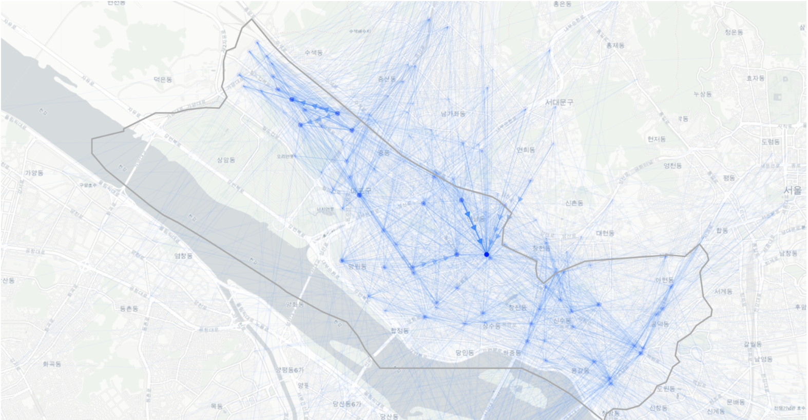
- Most traffic at DMC and Hongik University 2 Exit”
- These are the stations that people commute to work or school.
4.2. Afternoon (10am ~ 5pm)
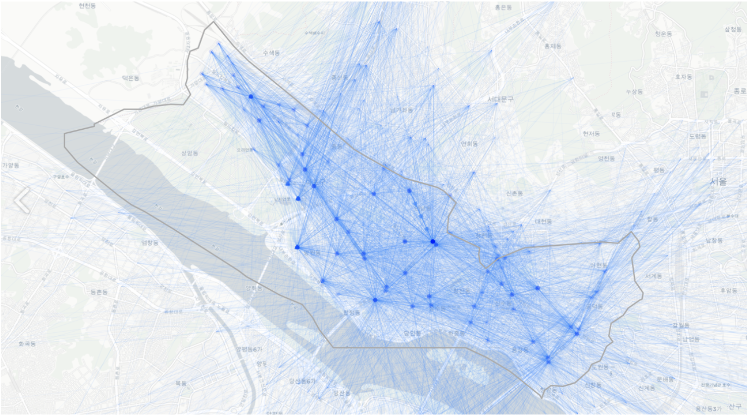
- More distributed traffic than 7am ~ 10am
- Stations at Hongik University still have a lot of traffic coming in which means that the bike operation management team has to move bikes from here to other stations to avoid shortage of bikes in certain stations. However, when it gets closer to 5pm when people start going home, they might need to have extra bikes at Hongik Univ. stations.
4.3. Commute back home (5pm ~ 8pm)
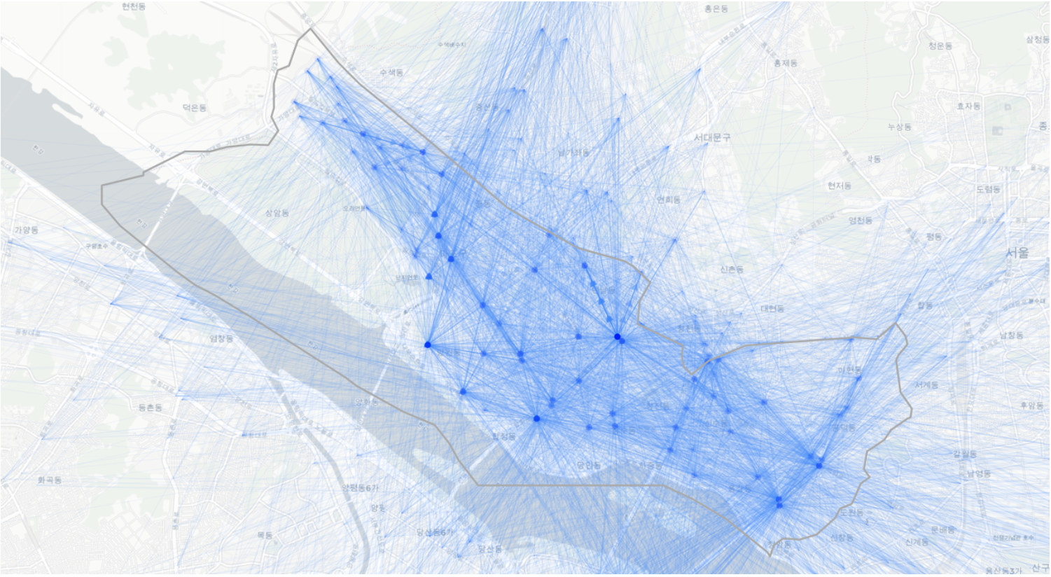
- As shown in the arrows, the very opposite happens when they are commuting back home.
- People are riding bikes to the Han River.
4.4. Night (8pm ~ 0 am)
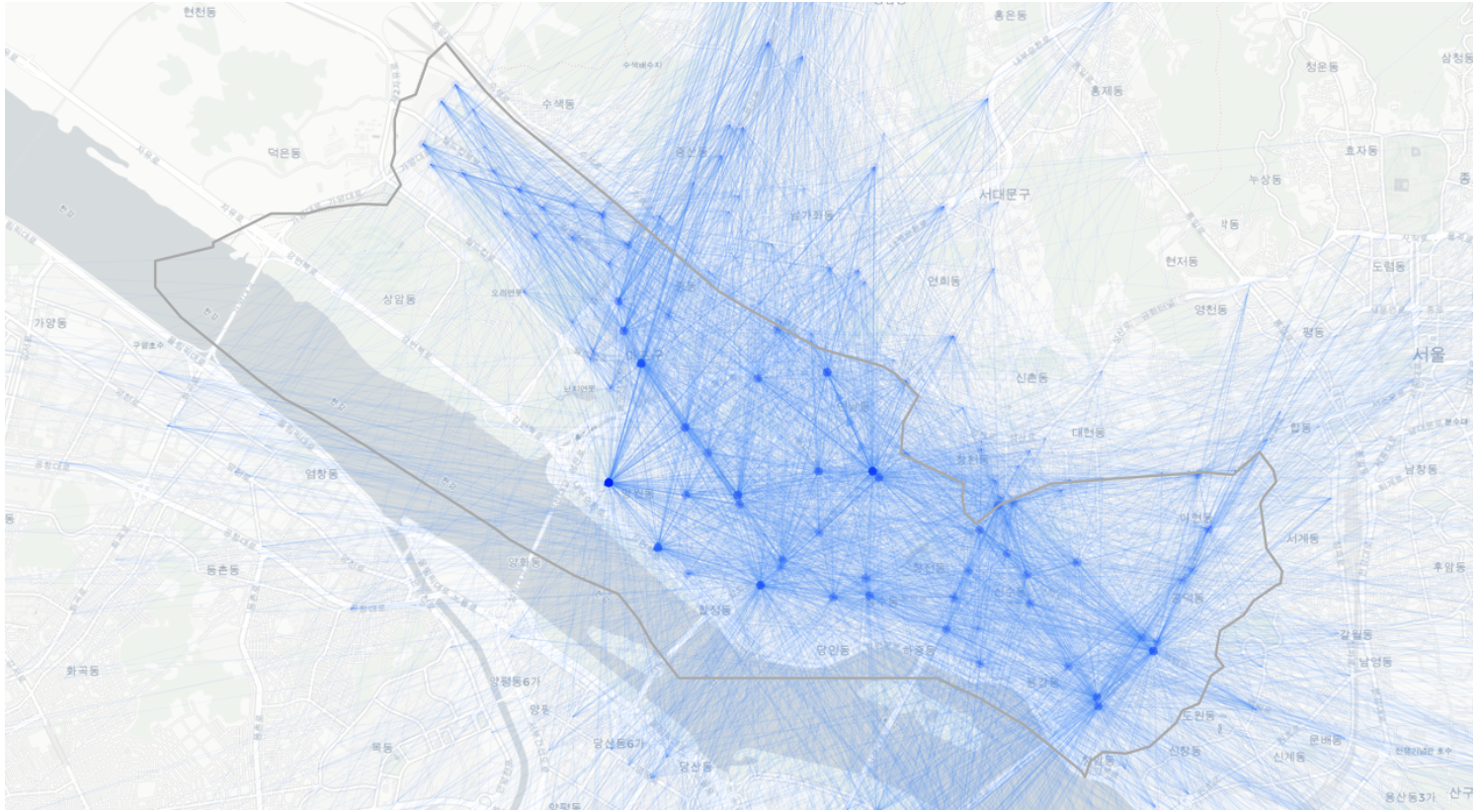
- Similar to 5pm ~ 8pm with relatively less traffic
5. Inflow/Outflow: Trips to and from Mapo County
With which county does Mapo county has most traffic?
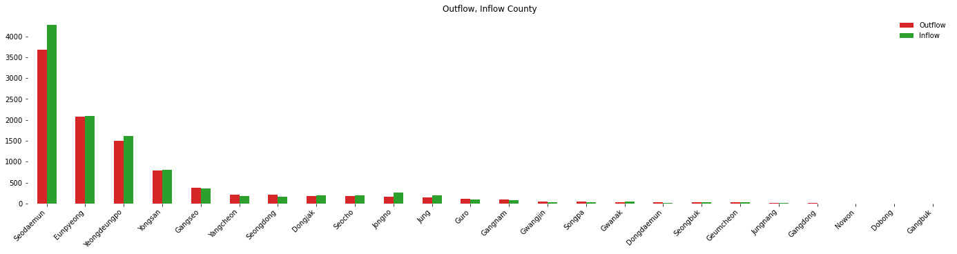
- Inflow-Outflow are in linear relationship. In other words, counties with high outflow have high inflow as well.
- As you might have guessed, there are many traffics to counties close to Mapo.
- Seodaemun > Eunpyeong > Yeongdeungpo > Yongsan
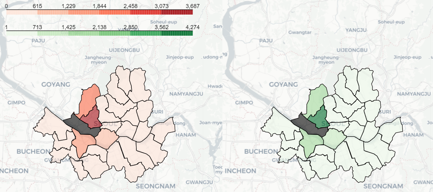 |
|---|
| Left: Outflow, Right: Inflow |
Summary
- Mapo has distinctive patterns in commute time.
- During 7am ~ 10am: inflow is approximately 30~35%
- During 5pm ~ 8pm: outflow is approximately 25~30%
- During commute time, there’s highest traffic at stations in DMC and Hongik University.
- Traffics with other counties are mostly with nearby counties.