[Seoul Bike] 02. Clustering Counties by Trip Pattern
Intro
In our last episode, we looked at Seoul Bike Stations across the city of Seoul.
In this post, we will explore the trips taken in February of 2021.
On top of the GPS/location feature from station dataset, the trips dataset has a time feature (time of rent, time of return) which introduces interesting questions.
- How does trips differ by counties, hours of the day, or days of the week?
- Do counties or stations have distinct characteristics with which we can cluster them into a few groups?
Data
I collected the data by using the API provided on the Seoul OpenAPI website. They also provide csv datasets for past trips, but I wanted to get the data in real-time so ended up using the API to fetch data.
With the datasets I found in multiple sources, I preprocessed and merged them together as shown below. Since we will be using county names in later part of this analysis, I translated the county names into English.
| start_time | start_station_id | start_station_name | end_time | end_station_id | end_station_name | duration | distance | start_hour | start_day | start_dayofweek | end_hour | county_x | county_eng_x | lat_x | long_x | county_y | county_eng_y | lat_y | long_y | |
|---|---|---|---|---|---|---|---|---|---|---|---|---|---|---|---|---|---|---|---|---|
| 0 | 2021-02-01 00:00:00 | 1514 | 강북구청 사거리 버스정류소 앞 | 2021-02-01 00:03:00 | 1554 | 번동사거리 | 2.0 | 736.02 | 0 | 1 | 0 | 0 | 강북구 | Gangbuk | 37.638805 | 127.028358 | 강북구 | Gangbuk | 37.635391 | 127.034554 |
| 1 | 2021-02-01 18:01:00 | 1514 | 강북구청 사거리 버스정류소 앞 | 2021-02-01 18:08:00 | 1554 | 번동사거리 | 7.0 | 779.26 | 18 | 1 | 0 | 18 | 강북구 | Gangbuk | 37.638805 | 127.028358 | 강북구 | Gangbuk | 37.635391 | 127.034554 |
| 2 | 2021-02-01 20:21:00 | 1514 | 강북구청 사거리 버스정류소 앞 | 2021-02-01 20:27:00 | 1554 | 번동사거리 | 5.0 | 0.00 | 20 | 1 | 0 | 20 | 강북구 | Gangbuk | 37.638805 | 127.028358 | 강북구 | Gangbuk | 37.635391 | 127.034554 |
| 3 | 2021-02-01 20:32:00 | 1514 | 강북구청 사거리 버스정류소 앞 | 2021-02-01 20:38:00 | 1554 | 번동사거리 | 5.0 | 736.02 | 20 | 1 | 0 | 20 | 강북구 | Gangbuk | 37.638805 | 127.028358 | 강북구 | Gangbuk | 37.635391 | 127.034554 |
| 4 | 2021-02-03 00:12:00 | 1514 | 강북구청 사거리 버스정류소 앞 | 2021-02-03 00:14:00 | 1554 | 번동사거리 | 2.0 | 628.99 | 0 | 3 | 2 | 0 | 강북구 | Gangbuk | 37.638805 | 127.028358 | 강북구 | Gangbuk | 37.635391 | 127.034554 |
print(df.info())
<class 'pandas.core.frame.DataFrame'>
Int64Index: 578407 entries, 0 to 578406
Data columns (total 20 columns):
 #   Column              Non-Null Count   Dtype
---  ------              --------------   -----
 0   start_time          578407 non-null  datetime64[ns]
 1   start_station_id    578407 non-null  object
 2   start_station_name  578407 non-null  object
 3   end_time            578407 non-null  datetime64[ns]
 4   end_station_id      578407 non-null  object
 5   end_station_name    578407 non-null  object
 6   duration            578407 non-null  float64
 7   distance            578407 non-null  float64
 8   start_hour          578407 non-null  int64
 9   start_day           578407 non-null  int64
 10  start_dayofweek     578407 non-null  int64
 11  end_hour            578407 non-null  int64
 12  county_x            578407 non-null  category
 13  county_eng_x        578407 non-null  category
 14  lat_x               578407 non-null  category
 15  long_x              578407 non-null  category
 16  county_y            578407 non-null  category
 17  county_eng_y        578407 non-null  category
 18  lat_y               578407 non-null  category
 19  long_y              578407 non-null  category
dtypes: category(8), datetime64[ns](2), float64(2), int64(4), object(4)
memory usage: 64.3+ MB
None
df.shape
(578407, 20)
EDA
1. Which Day of Week and Hour had the most frequent trips?
Let’s start with the simplest one. We will look at trips taken by Day of Week, Hour, County, respectively.
1.1 # of Trips by Day of Week
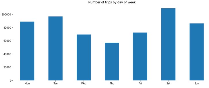
There were 27.1% more trips taken during weekends than weekdays. During weekdays, people rode more often on Tuesdays and Wednesdays. During weekends, people came out to ride bikes more on Saturday than Sunday.
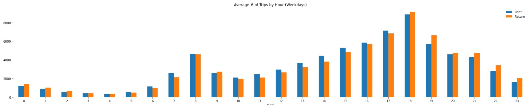
1.2 # of Trips by Hour
We can presume that the trip pattern might look different between weekdays and weekends. Let’s compare them and see if the difference exists.
On Weekdays
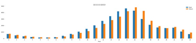
On Weekends
On Weekdays, people ride more at 8 am and 18 pm. Since people work 9 to 6 in Korea (one more hour than 9-5 in the US), this pattern may be due to commute time.
On Weekends, people ride more late in the afternoon and hit the peak around 18pm. This may vary depending on the season and the sunset time.
Otherwise, except for commute time. Rent > Return in the afternoon and Rent < Return in the evening.
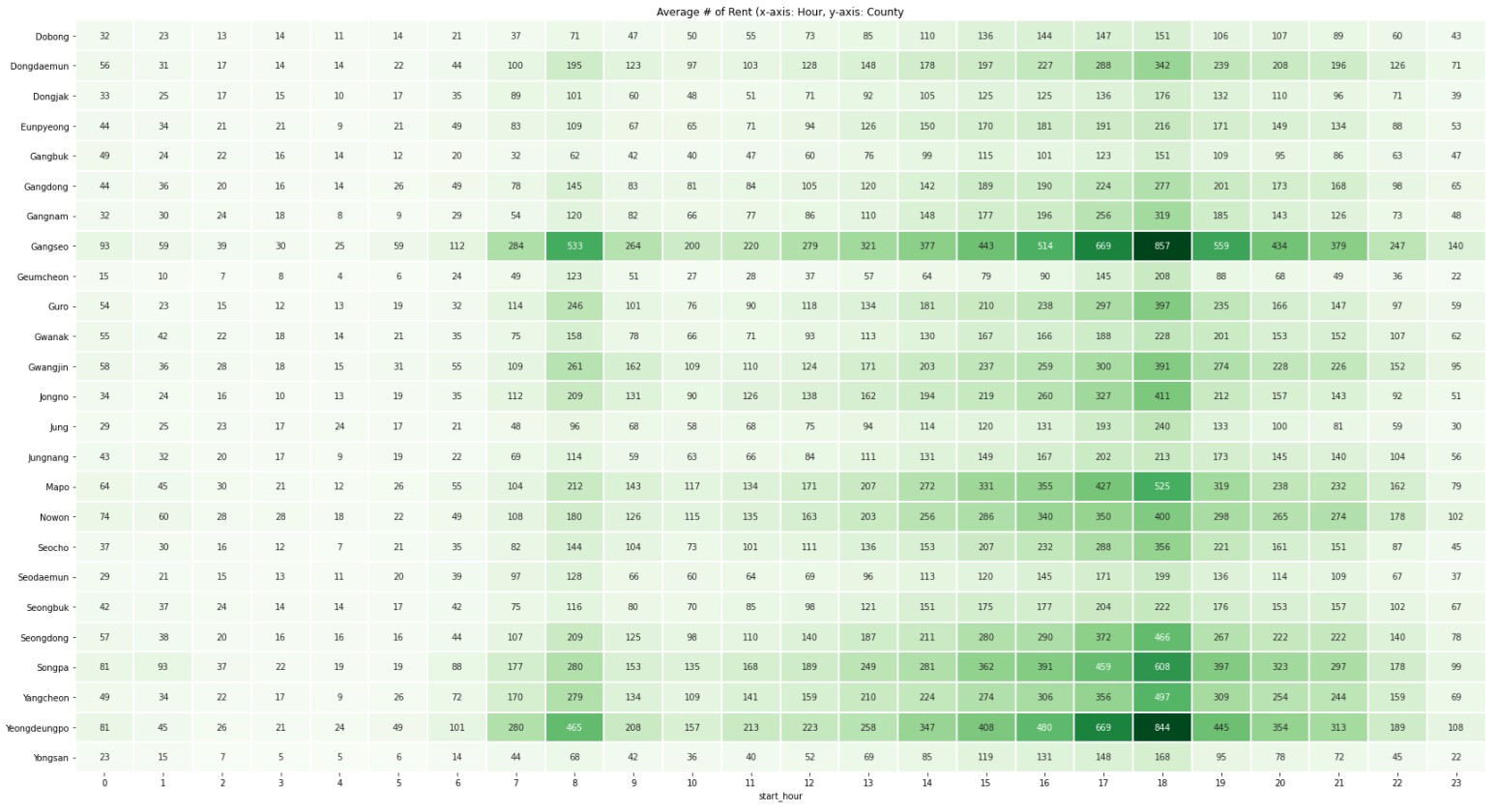
Does Hourly Trip Pattern Look Different by County?
Rent
Return
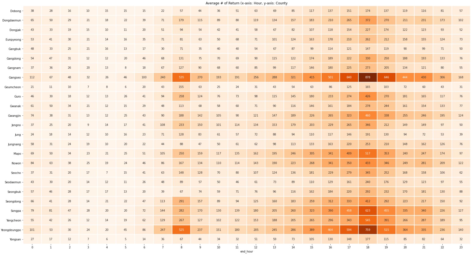
All counties have very similar hourly trip patterns.
The dark colors in commute time stick out which makes me wonder:
- Are there counties that have higher Rent or Return during commute time?
In the assumption that the purpose of trips during commute time is for commuting and they ride from one county to another, the bike management team can place more bikes in counties (or stations) in line with the demands.
Are there counties that have higher Rent or Return during commute time?
Let’s extract the trips taken during commute time (morning commute time 8am & evening commute time 18pm; Yes, it’s 9-6 in Korea, not 9-5). In addition, let’s look at the Rent to Return Ratio.
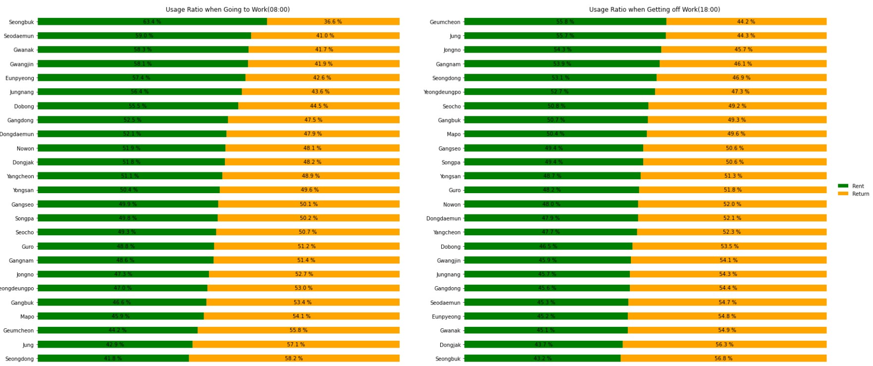
In the morning commute time, Seongbuk had 26% more Rents than Returns.
In the evening commute time, Geumcheon had 10% more Returns than Rents.
In the evening commute time, Seongbuk had 15% more Returns than Rents.
However, the two plots above have a different order of y-axis, so it’s quiet difficult to compare the difference in morning and evening commute time.
Let’s visualize just the Rents this time because Returns = Trips - Rents.
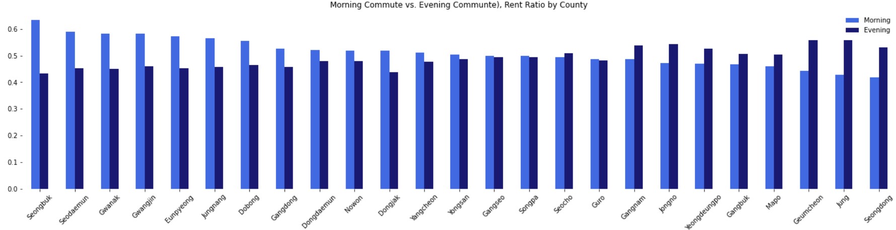
The morning commute bars gradually decrease, while the evening commute bars gradually increase.
In other words, counties with a higher Rent rate in the morning have a higher Return rate in the evening (The correlation is 0.8).
We can imagine that people ride bikes to commute from home -> work -> home on weekdays.
Well, this may be pretty obvious, but we can verify our groundless inference with this visualization now!
2. Which County has a High Trip Distance and Trip Hour?
We can assume that a county with a high average trip distance and trip hour has more riders who travel a further distances or ride longer.
Let’s first look at the trip distance.
2.1. # of Trips by Distance
Let’s draw the distribution in a boxplot and a distplot.
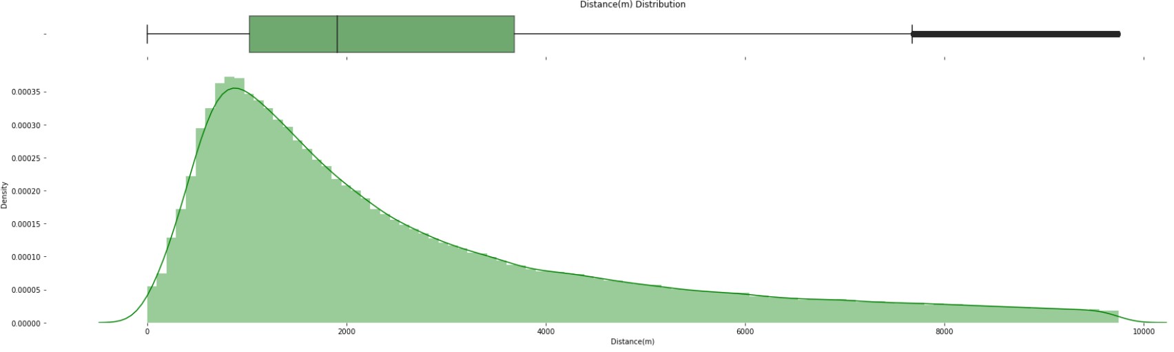
The distribution is skewed due to outliers. Let’s remove the outliers for the sake of better analysis.
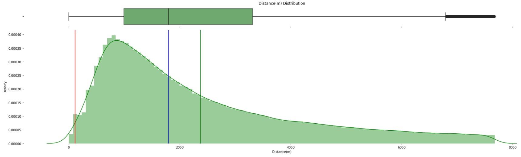
The distribution is still skewed a little bit, but the median is 1798 meters. Let’s dig a little deeper by looking at distributions by county.
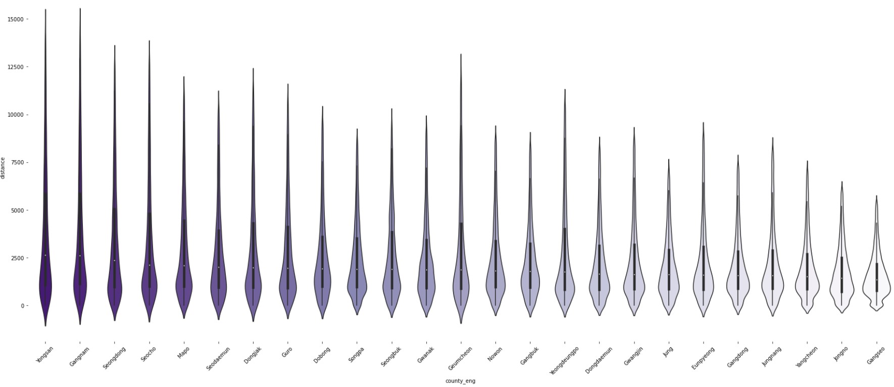
- The distributions are skewed in every county.
- Counties with a longer distance tend to have a higher median as well as more outliers.
2.2 # of Trips by Hour
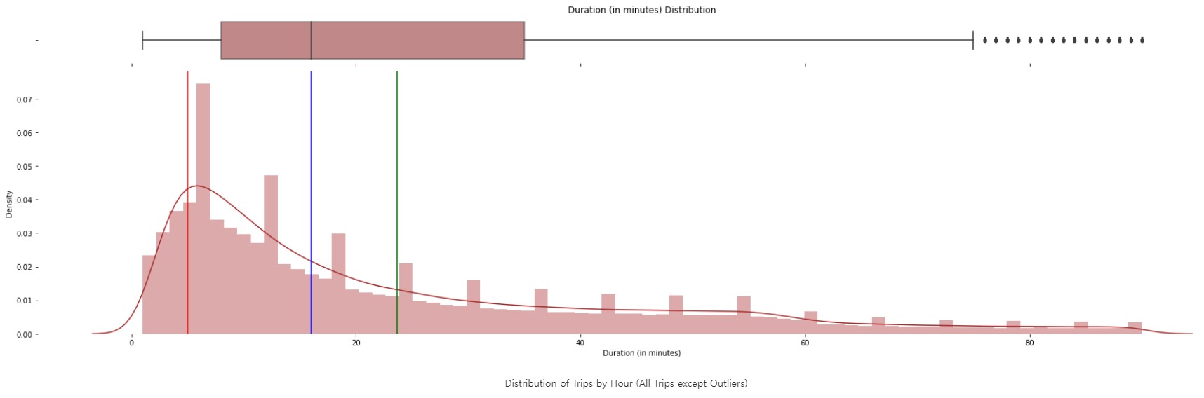
Mode: 5 Minutes Median: 16 Minutes Truncated Mean(5~95%): 23 Minutes
Distributions for distance and hour look very similar. Mode is 5 minutes, and the median is 16 minutes.
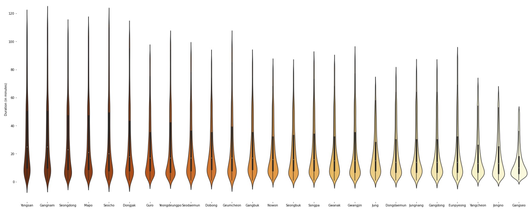
Trip Hour is very similar to Trip distance. It’s interesting that some counties (Yongsan, Gangnam) have more outliers than others (Gangseo).
Putting both distance and trip hour into maps:
- Yongsan has the highest distance and trip hours.
- Distance and Trip Hour have a very strong correlation (0.95). This is not a surprise since a rider has to take a longer trip to go further.
3. Which County Has a High Outflow/Inflow of riders?
Outflow/Inflow represent trips of riders that traveled from County A to County B. We can get the traffic traveling across counties this way.
Since the scale of the number of trips differs by counties, we will look at a relative ratio between counties instead of absolute value.
Outflow Ratio: Return at a different county after Renting at County A / Total number of Rents at County A
Inflow Ratio: Return at County A after Renting at a different county / Total number of Returns at County A
In short, we want to know how much % of Rents(Returns) in County A are Returned(Rented) in another county.
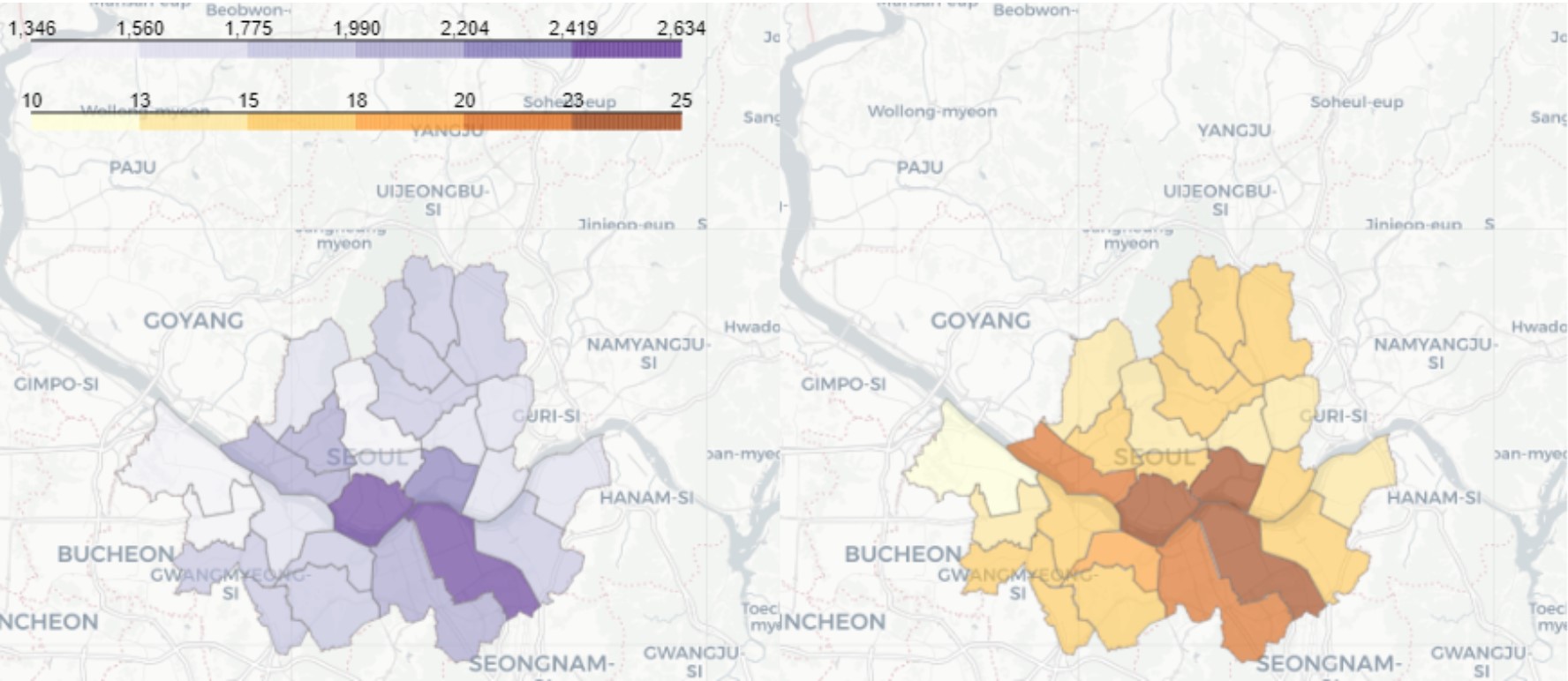
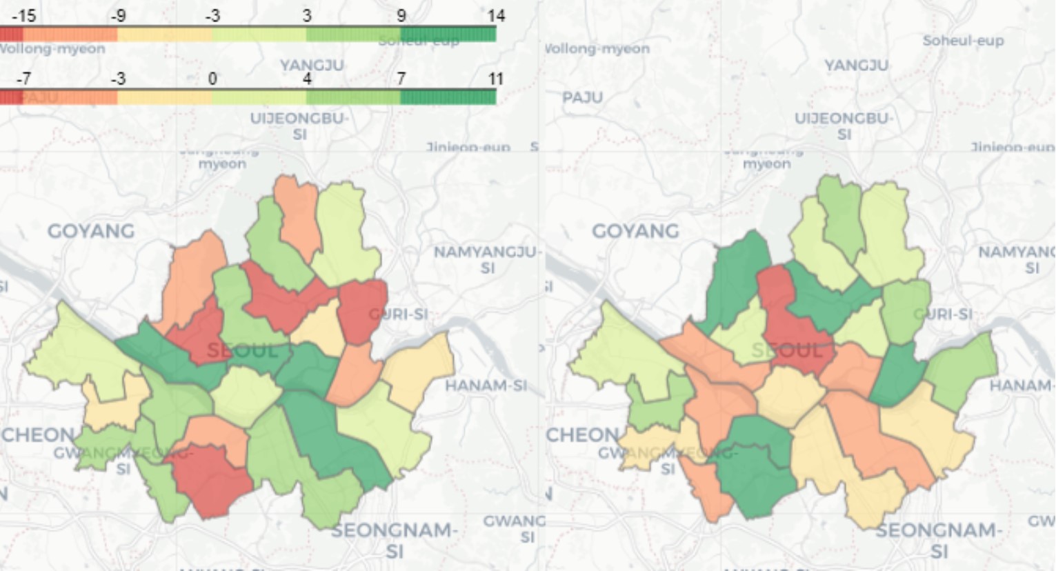
3.1. Mapping Outflow/Inflow Ratio of Counties
We can first check which counties have a high outflow ratio or inflow ratio.
- Jung (located in the center) has the highest outflow and inflow ratio. Counties in the center of Seoul have both high outflow and inflow ratios.
- Outflow ratio and inflow ratio have similar distributions. In other words, a county with a high outflow ratio has a high inflow ratio (correlation = 0.97).
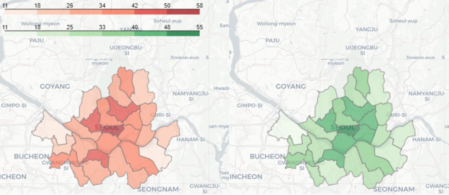
3.2. Adding Hour to Outflow/Inflow Ratio of Counties
Let’s throw time into the analysis and dig in for more insights
The outflow/inflow ratios have slightly different patterns! This finding triggers a new question:
- Can we cluster counties that have similar outflow/inflow ratios depending on time?
Since we have to look at the outflow/inflow ratio at the same time period, let’s take Measure = Inflow Ratio - Outflow Ratio If Measure > 0, more riders are coming to the county in that time period. If Measure < 0, more riders are going out of the county in that time period.
Let’s cluster counties with similar patterns in Measure by time period.
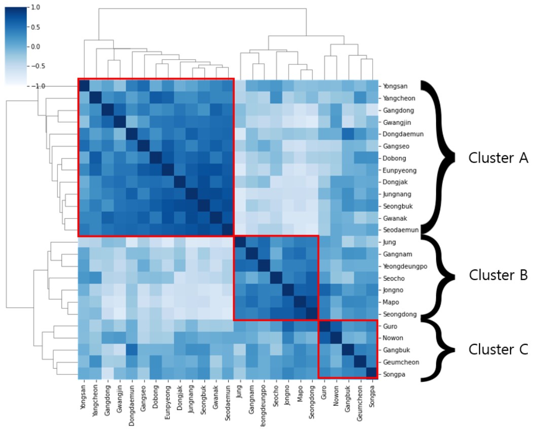
Do you see the 3 clusters!?
Now, let’s plot the Measure by time.
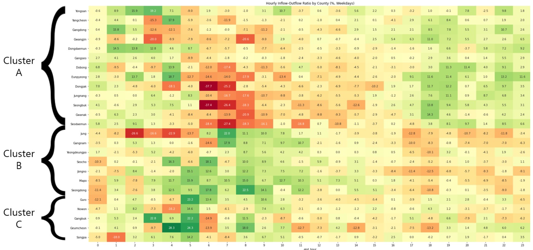
Red = Outflow > Inflow
Green = Outflow < Inflow
The clusters make sense!
- Cluster A represents counties with high inflow during morning commute time and high outflow during evening commute time. These counties tend to have relatively more companies than other counties.
- Cluster B is completely opposite of Cluster A. These counties are well known for being residential areas.
- Cluster C does not belong to either Cluster A or B. Patterns are not as clear as other clusters.
Some abnormalities are that:
Jung has significantly high outflow ratio from 2 - 4 am
Gangbuk has very high inflow ratio at 3 am
These abnormalities may be due to the fact that they move and distribute bikes to other counties during those hours.
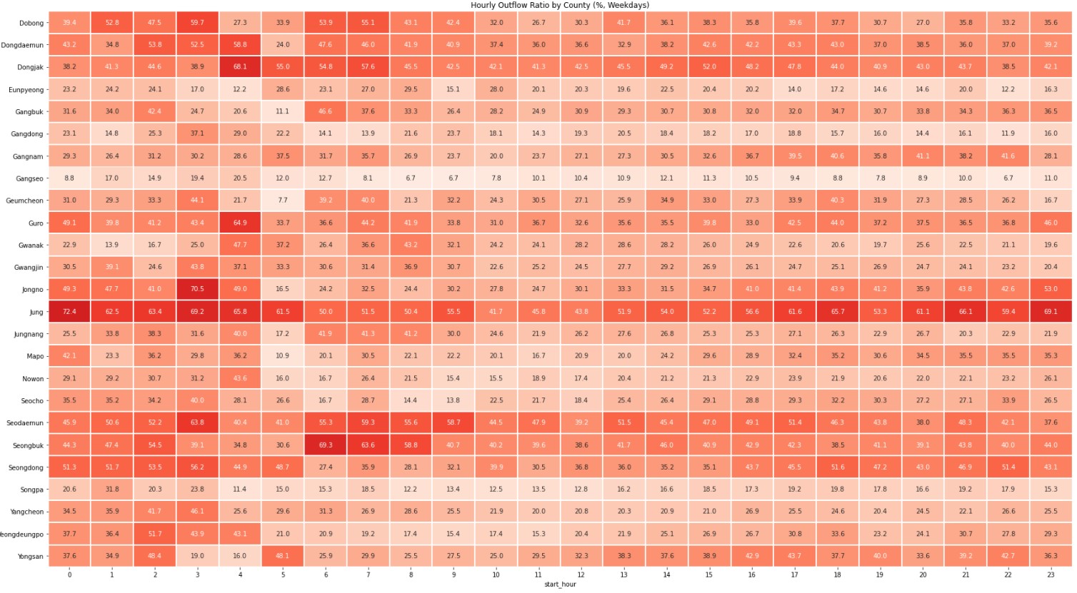
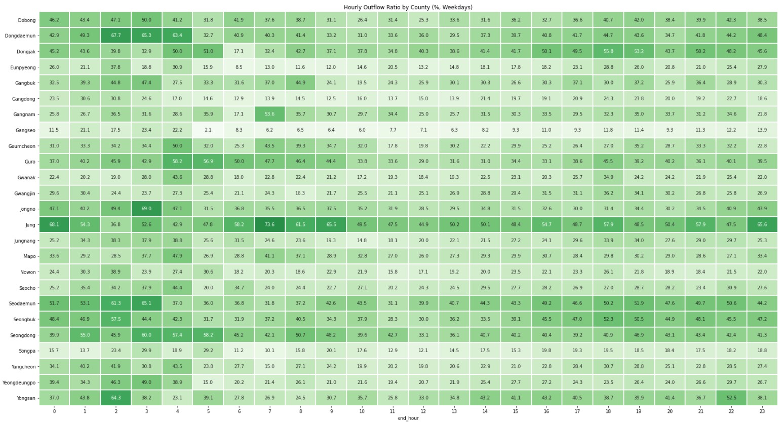
3.3. How do Seoul-ers in Each County Commute?
Let’s visualize it in a heatmap.
- Counties with a high outflow ratio during the morning commute time have a high inflow ratio in the evening commute time.
Summary
Counties with High Frequency of Trips
- Gangnam, Gangseo
County with High Distance and Trip Hour
- Yongsan
County with High Outflow, Inflow Ratio
- Jung
County with Drastic Change in Outflow, Inflow Ratios During Commute Time
- Geumcheon
In the next episode, I will build predictive models to predict the number of bikes available at each station at a specific time of the day.