[Finance] Interactive Stock Comparison Tool using Shiny
Say you have loaded your portfolio with a bunch of stocks or are searching for stocks to buy. No matter you are doing the former or the latter, or doing both simultaneously, you may wonder how the stocks have performed across a number of years and where they all stand compared to each other in different dimensions.
Now, you can display as many stocks as you want and compare all of them in terms of their price, PER, ROE, ROA, beta, growth over years, you name it.
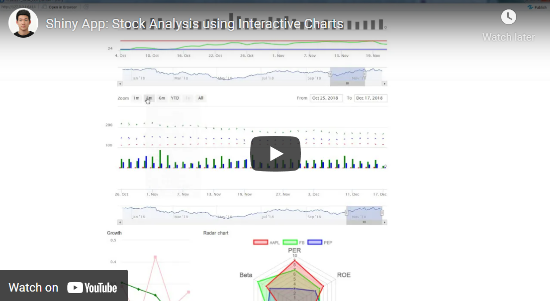
Here is a quick video of the shiny app I built:
Key Functions
- Auto complete tickers
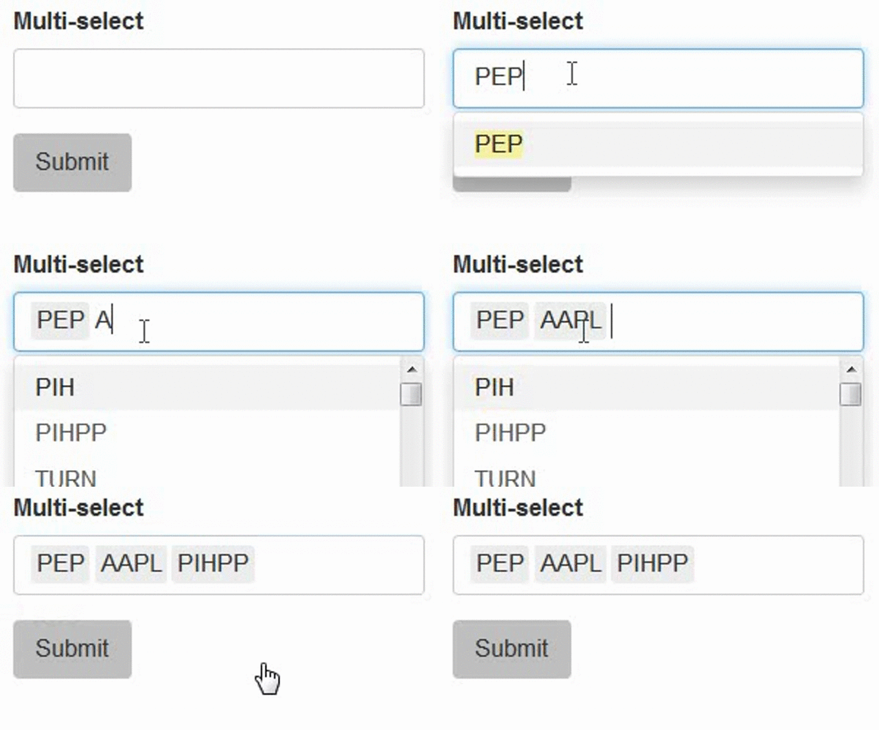
selectizeInput( ‘foo’, “Multi-select”, choices=my_autocomplete_list, multiple=TRUE)
The auto completion feature is simply done by the function selectizeInput. my_autocomplete_list is a list of tickers retrieved from a csv file.
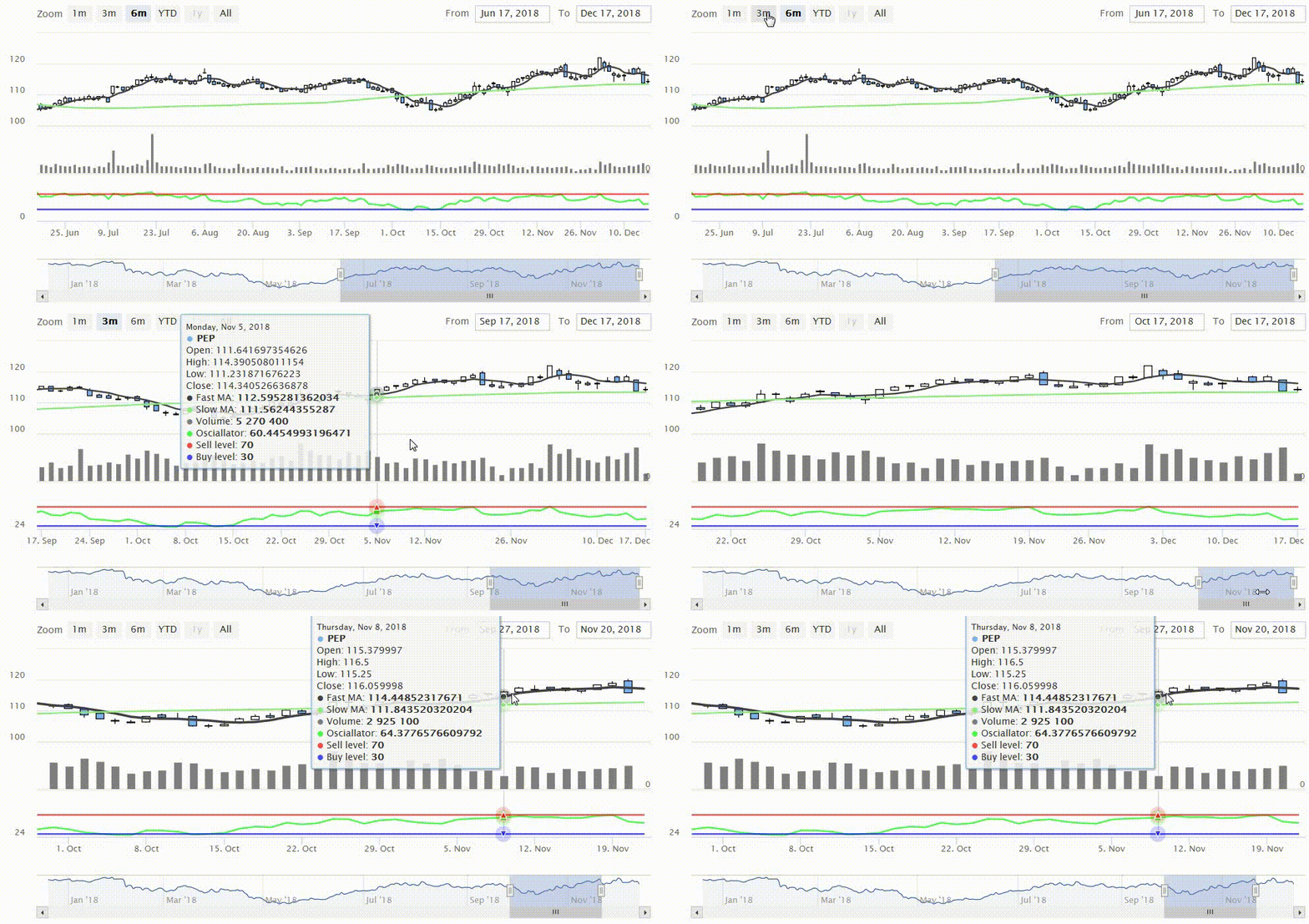
- Interactive Stock Chart
SPY <- adjustOHLC(x) SPY.SMA.10 <- SMA(Cl(SPY), n = 5) SPY.SMA.200 <- SMA(Cl(SPY), n = 100) SPY.RSI.14 <- RSI(Cl(SPY)) SPY.RSI.SellLevel <- xts(rep(70, NROW(SPY)), index(SPY)) SPY.RSI.BuyLevel <- xts(rep(30, NROW(SPY)), index(SPY))
output$chart1<- renderHighchart({ highchart(type = “stock”) %>% hc_yAxis_multiples( create_yaxis(3, height = c(2, 1, 1), turnopposite = TRUE) ) %>% # series hc_add_series(SPY, yAxis = 0, name = code1) %>% hc_add_series(SPY.SMA.10, yAxis = 0, name = “Fast MA”) %>% hc_add_series(SPY.SMA.200, yAxis = 0, name = “Slow MA”) %>% hc_add_series(x$Volume, color = “gray”, yAxis = 1, name = “Volume”, type = “column”) %>% hc_add_series(SPY.RSI.14, yAxis = 2, name = “Osciallator”, color = hex_to_rgba(“green”, 0.7)) %>% hc_add_series(SPY.RSI.SellLevel, color = hex_to_rgba(“red”, 0.7), yAxis = 2, name = “Sell level”) %>% hc_add_series(SPY.RSI.BuyLevel, color = hex_to_rgba(“blue”, 0.7), yAxis = 2, name = “Buy level”) })
The highchart package does a beautiful job displaying stock data. I also added volume, weighted average, oscillator, sell, and buy level on the chart as well.
- Line Chart
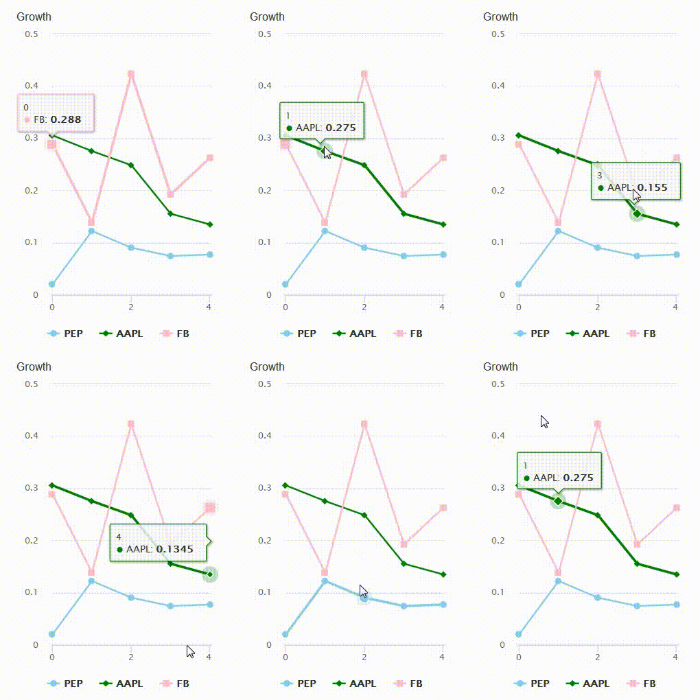
Highchart package provides a line chart feature as well. As for accessing the growth data, I used the saved csv file with financial information for each stock. Please refer to my previous post for more information about how to retrieve financial data.
- Radar Chart
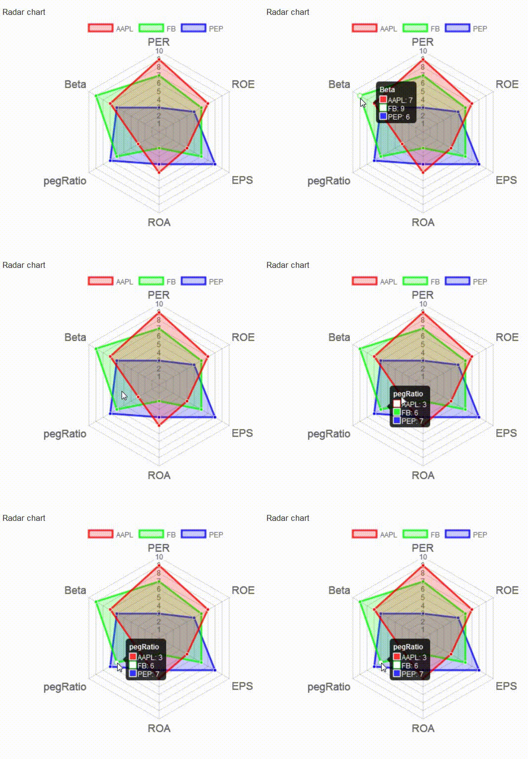
This part was a little tricky as I had to set clear standards of scoring for different dimensions, e.g., PER, ROE, EPS, ROA, pegRatio, Beta. In terms of scoring, I had to examine the quartiles of all stocks for each variable, divide it into 10 different score ranges, assign each stock a score from 1 to 10 depending on which score range it falls into. For example, AAPL scored 7 on ROE as it fell in a higher ROE score range than that of FB and PEP.
