Why the Stars Are Disappearing: US City Lights & Population
When was the last time you were mesmerized by a shower of stars in the sky?
I remember looking up to the sky on the way to family trip to a countryside in Korea, and I had my very first awestruck admire of the overwhelming beauty and grandness of the universe. I asked to myself ‘How many stars are there? How far away are they? How small am I in the universe? Can we visit them?’
A few weeks ago, after having a little exhausting day, I looked up in the sky covered with twinkling stars and wondered why it has been rarer for me to appreciate the stars. Is it because of air pollution? Have my eyesight gotten worse? Do I no longer have the sensitive, malleable heart to be grateful of the beauty of nature? Either one of these would be very sad, especially the last one.
When I arrived in my room, I searched the internet and found that the light which helps us see in most situations does the very opposite when it comes to looking at the sky which is called “light pollution.” According to my initial search, the light pollution is caused by excessive use of artificial lights of big cities, buildings, and shopping malls. In other words, the density of population has a proportional relationship with the amount of lights and therefore create light pollution.
However, when I looked up a satellite picture at night, there seemed to be areas, such as North Dakota, where I thought have a small number of population but has a high density of lights.
In order to solve such discrepancy between what’s on the internet and my observation, I delved into the truth of the matter by examining data from a weather satellite picture of North America at night, together with a map of US population.
Data Preprocessing
The original night data looks as below:
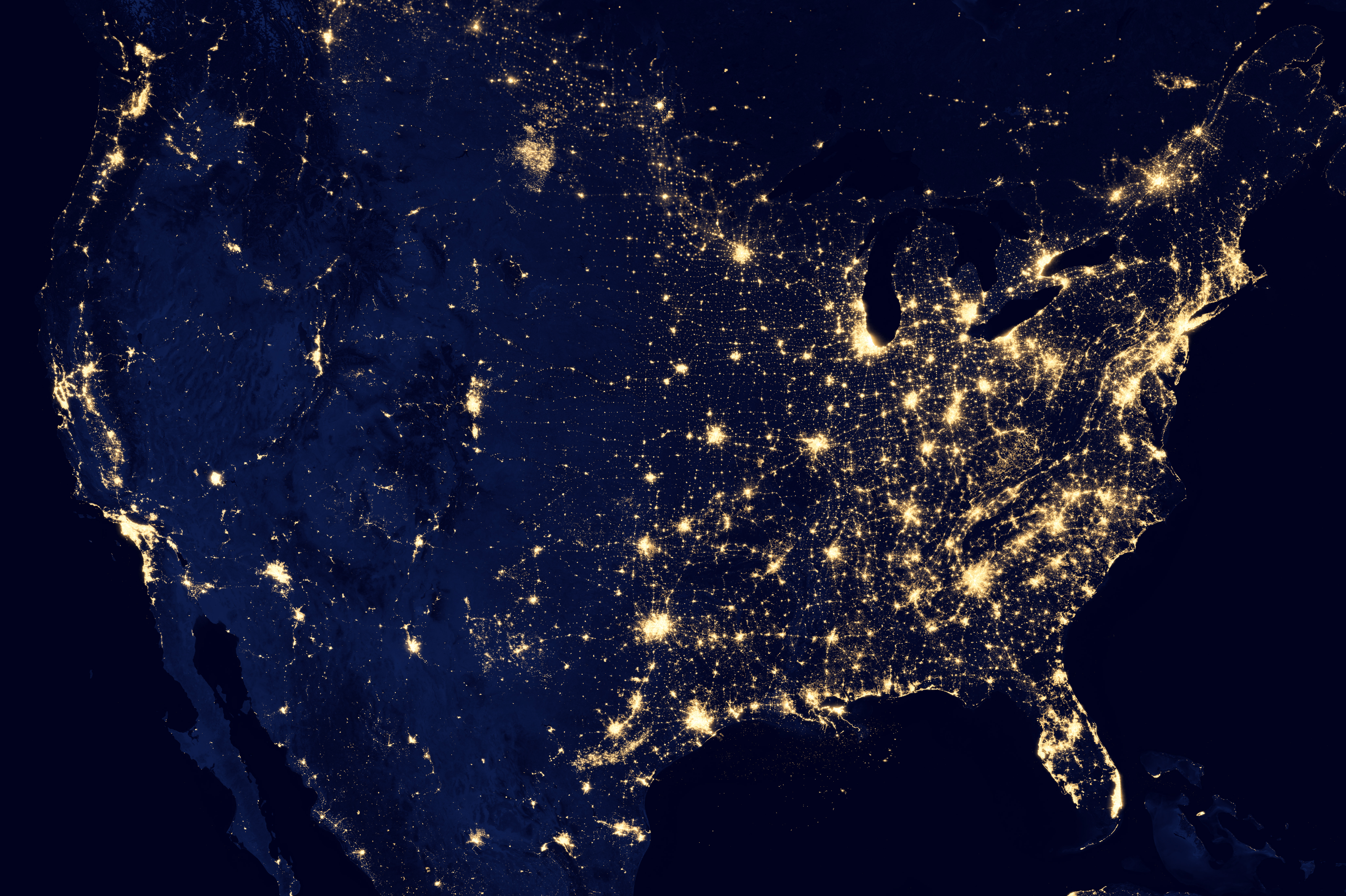
More information about this image can be found at: https://earthobservatory.nasa.gov/images/79800/city-lights-of-the-united-states-2012
Reformatting the data
The night data image was warped to approximately fit the projection used for the population data, by splitting it in half along a north-south line and then linearly interpolating each side. This warp process was not exact, as you will see, so the lights of a city will not always match the corresponding dots in the population data. Also, both the night data and the population data were converted to the ppm image format.
These images have about 25 million red-green-blue pixels each. This amount of data can be difficult to handle directly in R. Instead of processing the entire images, we will use two sets of cropped images in the same directory as the images above: first a cropped version showing the North Shore of Lake Superior (DuluthLights.ppm and DuluthPop.ppm) and then a cropped version showing more of the north central region of the US, including Minnesota, North Dakota and South Dakota (NorthCentralLights.ppm and NorthCentalPop.ppm).
Background on Images
A digital image is a rectangular array of picture elements, or pixels for short. In a color image, each pixel typically consists of three numbers. The three numbers represent the amount of red, green, and blue, respectively, in that pixel. If the numbers are 1, 0, and 0, then the pixel will appear to be pure red. If the numbers are 1,0,1, then it will appear purple. If the numbers are 1, 1, 1, it will appear white. If we have a 1000x1000 pixel image (a one megapixel image), we will have three million numbers to work with, since each pixel is three numbers: red, green, and blue. In R, it may be most convenient to represent an image as an array, e.g. a 1000x1000x3 array of doubles between 0 and 1.
1. Adding Blue and Green near Duluth
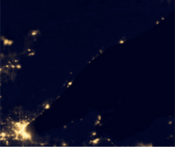
In this part, I am going to do some image modifications using a small cropped part of the initial light and population images. The bright spot in the lower left of the dark image below is the city lights of Duluth, Minnesota.
require(pixmap) require(ggmap) load(“C:\Users\user\Desktop\night.RData”) ggimage(dL)
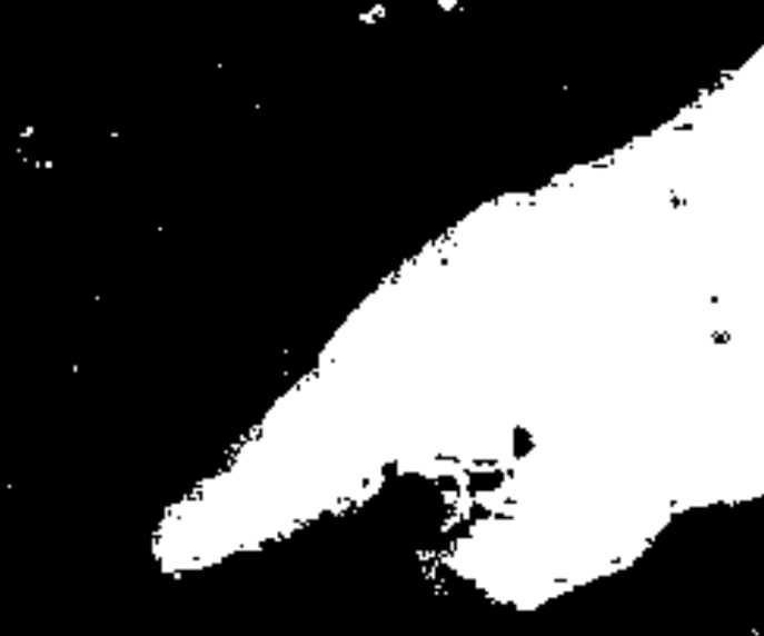
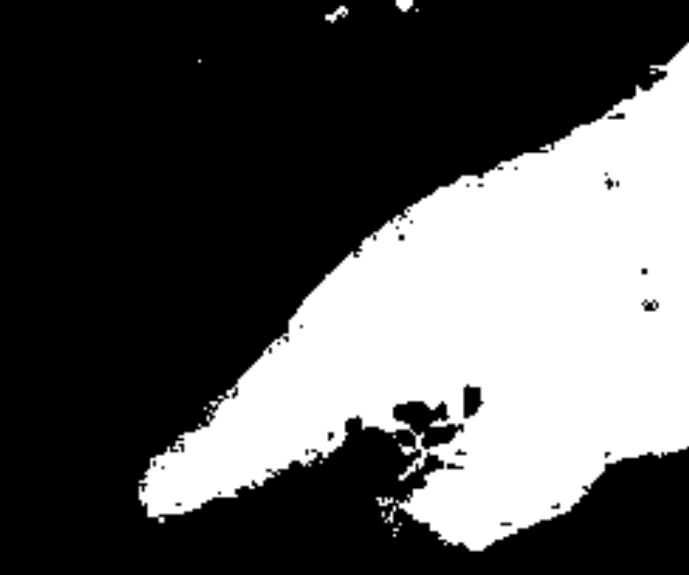
The colors represented by the dL array are mostly quite dark, but there are some areas that are especially dark. Here, I created a boolean matrix that indicates, for each pixel, whether the green channel is less than 0.01. I plotted this matrix with ggimage because ggimage can plot a matrix of booleans just as easily as an array of doubles.
dark.green<- dL[,,2] < 0.01 #RGB ggimage(dark.green)
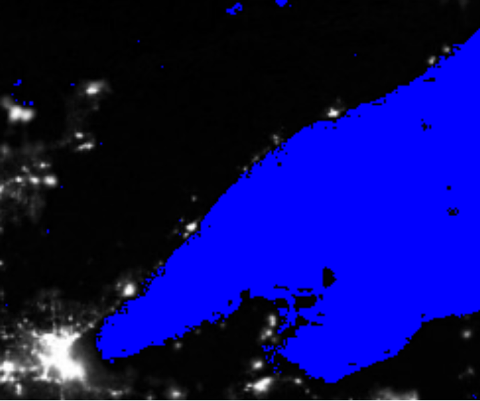
I used the boolean matrix from above to create a new array, in which each of the pixels that are especially dark are colored pure blue, but the other pixels keep their original colors.
blue<- dL blue[,,3]<- ifelse(dark.green,(blue[,,3]=1),dL) blue[,,2]<- ifelse(dark.green,(blue[,,2]=0),dL) blue[,,1]<- ifelse(dark.green,(blue[,,1]=0),dL) new<- ggimage(blue) new
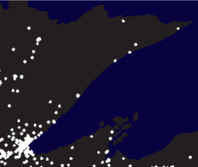
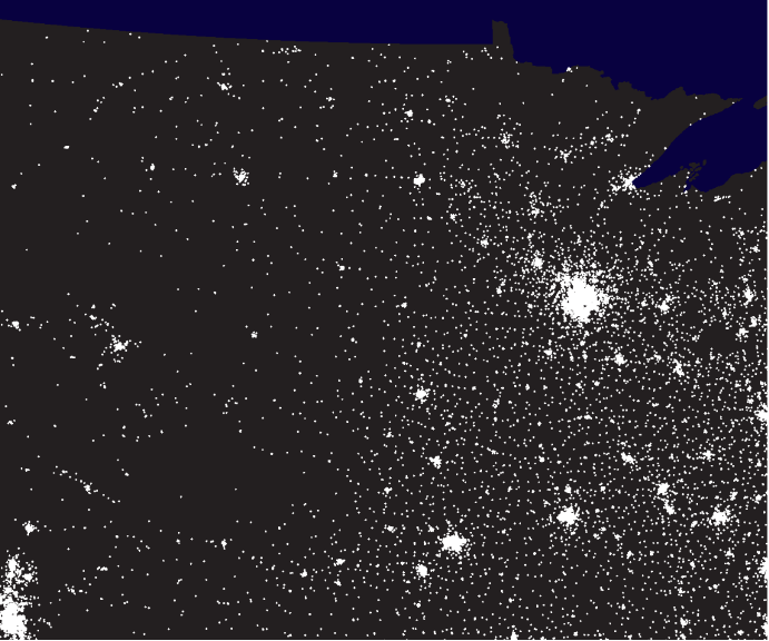
The data for population near to Duluth is in the dP array. The white dots represent 10,000 people each, and dark blue for Lake Superior and Canada.
ggimage(dP)
Once again, I created a boolean matrix showing which pixels have very low values in the green channel, perhaps again less than 0.01. This map shows that the bottom right white part is Lake Superior and the upper white part indicates Canada. However, we cannot differentiate the clear territory between Lake Superior and Canada with this map.
dark.green1 <- dP[,,2] < 0.01 ggimage(dark.green1)
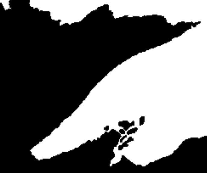
canada <- dark.green & dark.green1 ggimage(canada)
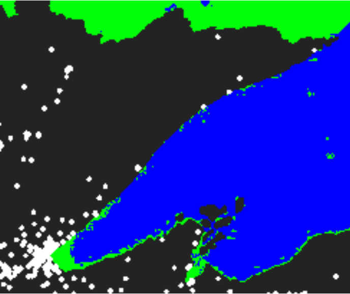
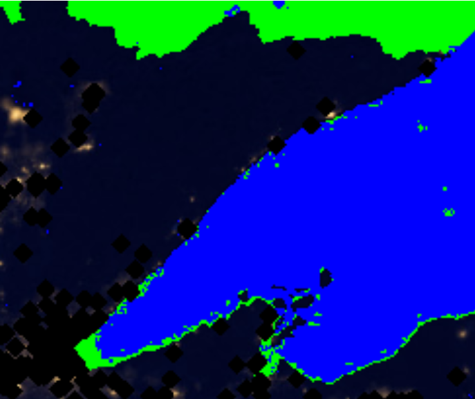
I used the boolean matrices above to create a new array dBoth in which Lake Superior is (mostly) blue, Canada is entirely green, and the remaining pixels show the night illumination.
dBoth <- dL dBoth[,,2] <- ifelse(canada, (dBoth[,,2]= 0), ifelse(dark.green1,(dBoth[,,2]= 1),dP)) dBoth[,,3] <- ifelse(canada, (dBoth[,,3]= 1), dP) dBoth[,,1] <- ifelse(dark.green1, (dBoth[,,1]= 0), dP) ggimage(dBoth)
2. Adding Pure Black
What would happen to the night image if the people in the major towns and cities turned all their lights off? We will try to get an approximation of this effect in several steps, below. Broadly speaking, we would like to make the areas of the night image that correspond to population centers black, and leave the rest of the image as it was in part A.
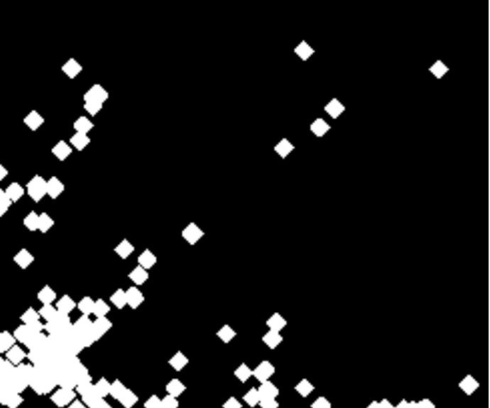
I created a boolean matrix from dP that records TRUE for all pixels that correspond to population dots, and FALSE otherwise. Plot this matrix.
pop.dot <- (dP[,,1] == 1) & (dP[,,2]== 1) & (dP[,,3] == 1) ggimage(pop.dot)
When I tried to plot the boolean matrix and compare it with the location of the lights in dL (by switching between different plots), I noticed that they don’t line up quite right as they should. In the next few steps, I modified the boolean matrix so that the population centers appear to grow outward, so that they can appear to cover more of the brightly lit areas.
left <- function(m){ b <- ncol(m) a <-m[,2:b] a<- cbind(a,c(F)) return(a) } n <- matrix(c(F,F,T,F,T,T,T,T,T),ncol=3) left(n) right <- function(m){ b <- ncol(m) a <-m[,1:(b-1)] a<- cbind(c(F),a) return(a) } right(n) up <- function(m){ b <- nrow(m) a <-m[2:b,] a<- rbind(a,c(F)) return(a) } up(n) down <- function(m){ b <- nrow(m) a <-m[1:(b-1),] a<- rbind(c(F),a) return(a) } down(n)
In order to line them up, I built four functions to shift a boolean matrix left, right, up, and down, respectively. For example, if the test case looks like this:
FFT
FTT
TTT
then, when it is shifted left (you add a column of FALSE), it should look like this:
FTF
TTF
TTF
dilate <- function(x){ e <- right(x) f <- left(x) g <- up(x) h <- down(x) y <- matrix(c(F),ncol=ncol(x),nrow=nrow(x)) y[e == T] <- T y[f == T] <- T y[g == T] <- T y[h == T] <- T return(y) }
I also built a function that uses your four shift functions to dilate the matrix, as follows: any matrix element that is already TRUE or that has a TRUE neighbor left, right, up, or down should become TRUE. For example, the following test matrix:
FFFFFFFFFFFFF
FFFFFFFFFFFFF
FFFTTTFFFFFFF
FFFFFFFFFFFFF
FFFFFFFFFFFFF
FFFFFFFTTTFFF
FFFFFFFTTFFFF
FFFFFFFFFFFFF
should change to look like this:
FFFFFFFFFFFFF
FFFTTTFFFFFFF
FFTTTTTFFFFFF
FFFTTTFFFFFFF
FFFFFFFTTTFFF
FFFFFFTTTTTFF
FFFFFFTTTTFFF
FFFFFFFTTFFFF
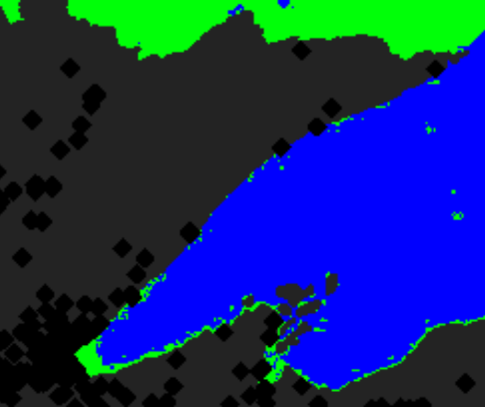
Then, I applied my dilation function three times to the boolean matrix from step one, to create a new boolean matrix that has more spread out estimates of significant population centers.
pop.dot <- dilate(pop.dot) ggimage(pop.dot)
3. Scaling up
Now that I have a method for treating the data at a small scale, I tried some bigger data. For this part, I will only use medium size images, because the my laptop may not be able to handle the full dataset in R.
The data for the north central region of the United States, including Minnesota and North and South Datoka, is again stored in two arrays called ncL and ncP for lights and populations, respectively.
ggimage(ncL)
ggimage(ncP)
I had to prepare to process these larger images in the same way that you processed the small images in Part A and Part B. That is, I went back and rewrote my code so that it can be run with a new pair of arrays easily. I created a function that takes two arguments, each of which is an array representing an image, and for which the return value is a new array that contains the desired blue, green, and black areas. Then, I tested my rewritten code using the small images.
map.edit <- function(a,b){ Lboolean <- ifelse(a[,,2]<0.01,T,F) Pboolean <- ifelse(b[,,2]<0.01,T,F) C <- matrix(T,nrow=nrow(a),ncol=ncol(a)) C[Lboolean == T] <- F C[Pboolean == F] <- F dBoth <- a dBoth[,,1][Lboolean == T] <- 0 dBoth[,,2][Lboolean == T] <- 0 dBoth[,,3][Lboolean == T] <- 1 dBoth[,,1][C == T] <- 0 dBoth[,,2][C == T] <- 1 dBoth[,,3][C == T] <- 0 Tot <- b[,,1]+b[,,2]+b[,,3] Pop <- matrix(T,nrow=nrow(a),ncol=ncol(a)) Pop[Tot!=3] <- F Pop <- dilate(Pop) Pop <- dilate(Pop) Pop <- dilate(Pop) dBoth[,,1][Pop == T] <- 0 dBoth[,,2][Pop == T] <- 0 dBoth[,,3][Pop == T] <- 0 return(dBoth) } ggimage(map.edit(dL,dP))
Finally, I applied my function to the medium size images
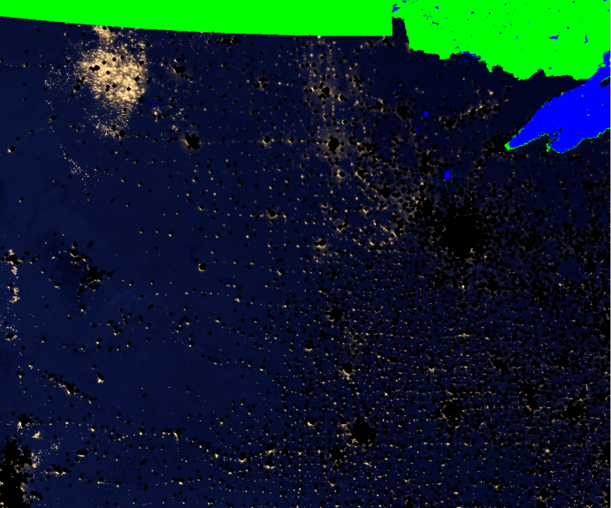
ggimage(map.edit(ncL,ncP))
Findings
One interesting thing we see when comparing the dark spots (population) and the bright spots (lights) is that the top left corner of the plot, which is a part of North Dakota, shows a scare number of people and yet a high concentration of lights. This observation counters a prevalent hypothesis that the place where lots of lights occur should reflect a large density of population. Rather, the observation of the image implies that the lights here are most likely produced from something other than the number of people. After reading the article, I concluded that it is very likely that the lights here are not produced by people, but from the large amount of gas flares that are burning in the oil fields. Additionally, the place most gas flares occur seems to correspond to the Bakken Expansion Link mentioned in the article as the major influence of the increasing gas flaring these years.
